Gaussian Process (GP)
Introduction
I ran across Gaussian Processes and was very intrigued by the whole concept. GPs look at regressions from a quite different and unique angle. Using GPs for regression allows you to understand how confident a certain prediction is. Furthermore, GPs are non-parametric and you can see a great respone by Shankar Sankararaman to what are the differences between a parametric and non-parametric model. In short, a non-parametric model bases its predictions on all the training data it has, whereas a parametric model learns a set of parameters that best models the data, and uses those parameters to make new predictions. Furthermore, GPs are useful when we know the nature of the function, making it even easier to model.
What is a GP?
GP defines a gaussian distribution that models the whole function. So say you have a function f(x) where x ranges from 0 to 100. And we slice our domain into discrete values, so x can only be an integer. The Gaussian distribution has a dimension for every possible x value. So, in this case, the Gaussian distribution would have 100 dimensions and for each dimension, its axis represents the values that the function can take. For example, if we were to marginalize the whole distribution such that we are looking at a 1D distribution of P(f(x) | x = 44), we would see a distribution of the values of f(x) on the slice of the graph where x = 44.
The Gaussian Distribution (GD)
We just looked at a small chararacteristic of our GD. Recall that a GD requires 2 parameters, the mean vector and the covariance matrix. Often the mean vector is just 0. But the covariance matrix is where things get really interesting. You might ask “isn’t the covariance matrix fixed in size”. That is correct we can’t just hardcode it because imagine we want to look at a greater resolution within an area or look at a greater ranger overall, it requires more dimensions to be able to do that. This is why kernels are used. A kernel is a function that can produce a covariance matrix. This is an example of a covariance matrix.
array([[ 2.56,  1.96,  1.36,  0.76,  0.16, -0.44, -1.04],
       [ 1.96,  1.56,  1.16,  0.76,  0.36, -0.04, -0.44],
       [ 1.36,  1.16,  0.96,  0.76,  0.56,  0.36,  0.16],
       [ 0.76,  0.76,  0.76,  0.76,  0.76,  0.76,  0.76],
       [ 0.16,  0.36,  0.56,  0.76,  0.96,  1.16,  1.36],
       [-0.44, -0.04,  0.36,  0.76,  1.16,  1.56,  1.96],
       [-1.04, -0.44,  0.16,  0.76,  1.36,  1.96,  2.56]])
The diagonal from top left to bottom right repersents the variance for random variable f(x), where the variance f(xi) is on the ith row and column. The values on the ith column and jth row, repersents the covarriance between f(xi) and f(xj). So a kernel defines a function where K(xi, xj) = cov(f(xi),f(xj) if i ≠ j. If i = j, then it equals var(f(xi)).
Kernel(s)
Radial Basis Function Kernel
Here is the equation for the RBF Kernel from the Kernel Cookbook.
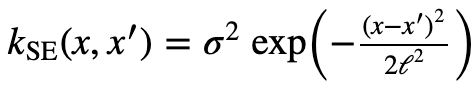
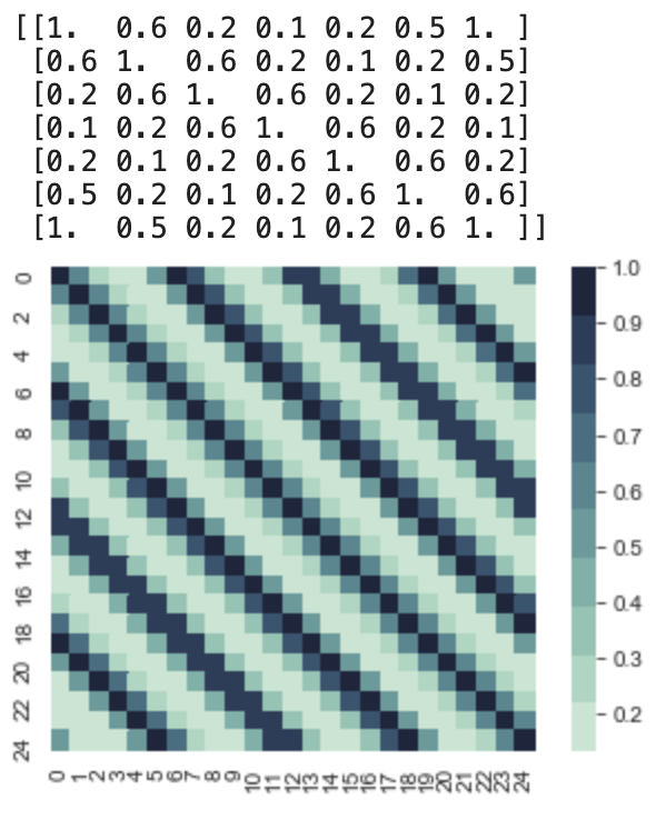
Different Kernels model different functions with specific characteristics. Let’s take a look at an important kernel called the RBF kernel (Radial basis function kernel). Below is a simple code that produce a covariance matrix using this kernel from x = 0 to x = 24, and σ = 1, l = 1.
#RBF Kernel
K = np.zeros((25,25))

for xi in range(25):
    for xj in range(25):
        K[xi,xj] = np.exp(-(((xi)-(xj))**2)/2)

print(np.round(K[0:7,0:7],1))

with sns.axes_style("white"):
    ax = sns.heatmap(K, square=True,  cmap=sns.cubehelix_palette(10,rot=-.2))
    plt.show()
This yeilds us:
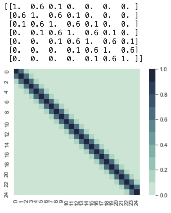
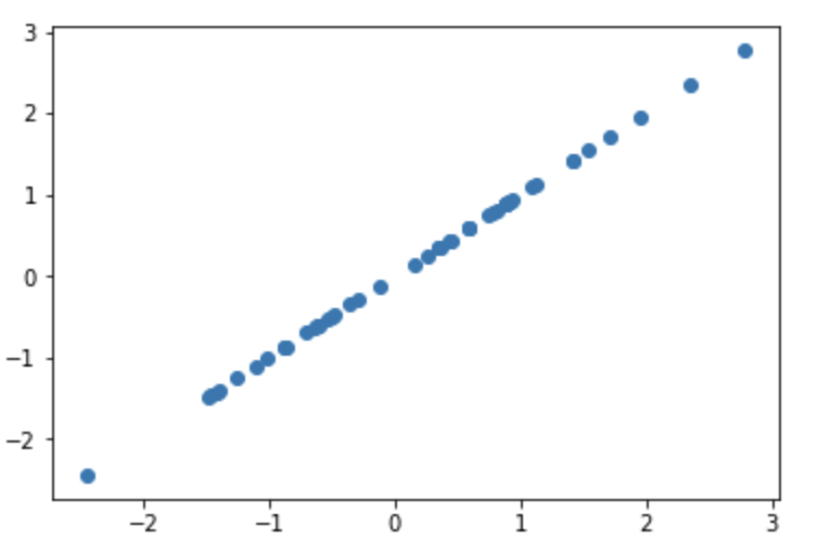
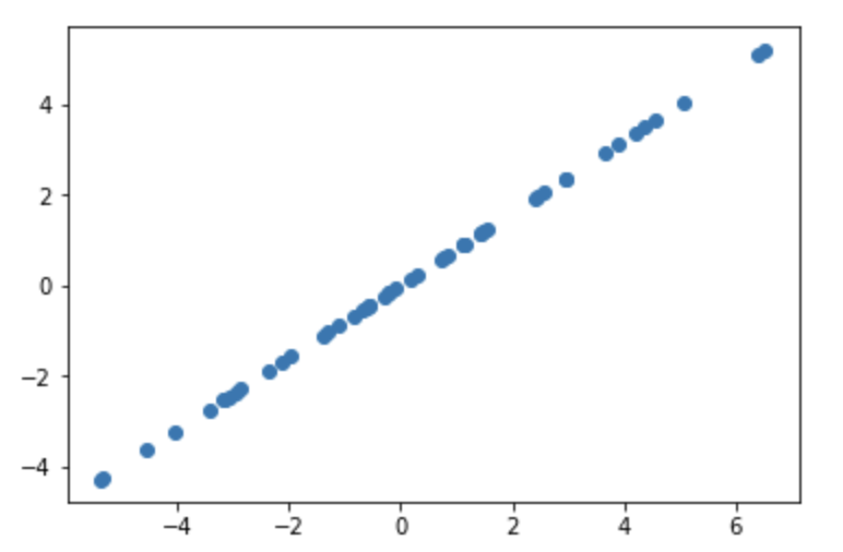
So let’s decompose this covariance matrix and get an intuition of the function it models. We can see that all the variances are 1, and as aforementioned the mean vector is 0. So this function is going to fluctuate around y = 0. If we sample the first point, whose x value is 0, we are sampling from a normal 1D gaussian with mean 0, and variance 1. So lets say we get f(0) = 2. Then we would need to sample f(1) given that f(0) = 2. So we would look at the conditional distribution now. This we can still visualize, let’s take a look at samples of the first two dimensions, f(0) and f(1). I wrote this snippet to sample from the first two dimensions.
samples = np.random.multivariate_normal([0,0], [[1,.6],
                                                [.6,1]], 50)
plt.scatter(samples[:,0],samples[:,1])
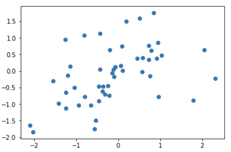
This gives us the scatter plot above, where the “x” axis represents f(0) and the “y” axis represents f(1). Therefore, we can see that the P(f(0)|f(1) = 2) is a normal distribution whose mean is around 1.5. This should make sense given their covariance is .6. Now if we sample from that distribution, and get f(1) = 1. Then we can move on to sampling f(2). To sample from f(2) we would have to sample P(f(2) | f(1) = 1, f(0) = 2). If we look at the covariance matrix, the covariance between f(2) and f(1) is .6, and the covariance between f(2) and f(0) is .1. This is important because a covariance closer to 0 means the two variables aren’t as correlated, and they are closer to becoming independent. So sampling f(2) would approximately equal to sampling from P(f(2) | f(1) = 2). However, we don’t do that in practice, because it’s not exact, this is just to give you an idea of how the covariances affect the function, and how to tell the nature of the function based on the covariance matrix. Sampling from the RBF kernel produces random but smooth functions because each new value of f(x) is most correlated with f(x-1) and a bit less correlated by f(x-2) and so forth. And this kernel has the parameter σ and l, which controls how elongated the smoothness is and how large the values of f can be respectively. Take a pause and look at the kernel equation to understand what that is.
Periodic Kernel
Here is the Periodic Kernel from the Kernel Cookbook.
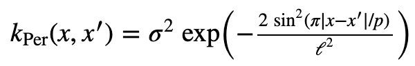
This is a very interesitng kernel, as it models peroidic functions. I set the parameters as this: σ = 1, l = 1, p = 2π. I produced the kernel using the following code:
#Periodic Kernel
K = np.zeros((25,25))

for xi in range(25):
    for xj in range(25):
        K[xi,xj] = np.exp( -2*math.sin( math.pi*abs(xi-xj)/(math.pi*2) )**2 )

print(np.round(K[0:7,0:7],1))

with sns.axes_style("white"):
    ax = sns.heatmap(K, square=True,  cmap=sns.cubehelix_palette(10,rot=-.35))
    plt.show()
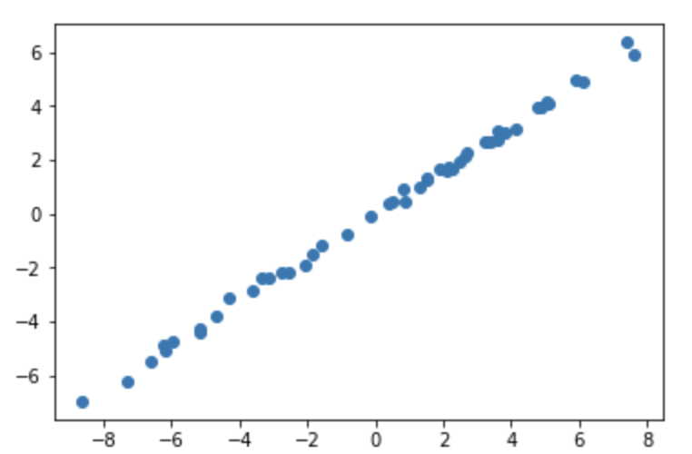
This yields us the following covariance matrix for x = 0 to x = 24. This is periodic and if we look at at the upper 7x7 matrix. We notice that it looks similar to the RBF kernel. But the second we try to sample the 7th value, we get something very interesting. The covariance between the 7th value and the 1st value is 1, and since their variances are all 1, this is important. To understand why, take a look at this code followed by the result.
samples = np.random.multivariate_normal([0,0], [[1,1],
                                                [1,1]], 50)
plt.scatter(samples[:,0],samples[:,1])
This is a straight line, with absolutly no deviation! This is why the kernel is able to model a perodic function. If f(x1) = 1, f(x7) has to equal 1, and this is true for pair of xi and xj. Meaning that if |i-j| = 7, then f(xi) = f(xj).
Linear Kernel
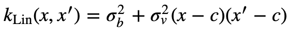
Here is the Linear Kernel from the Kernel Cookbook.
The linear kernel took me a while to understand, and I will try to do a decent job of summarizing it. Here is a code to produce a covariance matrix using the linear kernel. I set c = 0, σv = .5, σb = 0
#Linear Kernel
K = np.zeros((25,25))

for xi in range(25):
    for xj in range(25):
        K[xi,xj] = .5*(xi-5)*(xj-5)

print(np.round(K[0:7,0:7],1))

with sns.axes_style("white"):
    ax = sns.heatmap(K, square=True,  cmap=sns.cubehelix_palette(10,rot=-.35))
    plt.show()
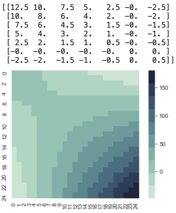
As you can see linear kernel has three parameters, the first is c, which controls the x intercept, where x=c is 0. The σv controlls how much variance there is at f(c). This is imporant because if you know your x intercept, and also know around how constrained you want to be, you can model that. The final parameter, σb controlls how steep the slope is, which is done by changing the variance of the starting point x0. If σb = 0 then sampling the first two points will produce a perfectly straight line, since the second point has to be positioned so that the whole line crosses the x axis at x = c.
However if σb ≠ 0, then then sampling the first two points will produce more variation, since the 2nd point can have multiple values.
Affine Transformation
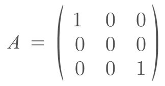
We do not define a covariance matrix, instead, we use a kernel to produce the covariance matrix. Most importantly, we feed in the input (x values for the 2D case) into the kernel. These inputs are located wherever we desire. In the examples I made, I set them to be evenly spaced in a given range. However, why can we do that? Technically there is an infinite number of inputs, and our kernel can process all of them. But it’s impossible to process an infinite number of inputs. So when we are building a covariance matrix for the inputs we chose, we are marginalizing all the other inputs out. To better understand this let’s look at an example. Say we want to look at 2 input values, which are x = 0 and x = 2. But there is an infinite number of values between 0 and 2. When I am sampling f(2) given f(0) = some constant, the distribution I talk about earlier, is the distribution you would get if you marginalize out all the values between x = 0 and x = 2. But you might notice that we didn’t do any marginalizing calculations, we just used the covariance matrix. This is where the affine transformation property for Gaussian Distributions is used. It states that if I have a random variable X, which is normally distributed accord to a certain μ and Σ (covariance matrix symbol), and I do a linear transformation A to x and add a constant vector b. Then my new distribution of AX+b is a normal distribution which can be represented as N(Aμ + b, AΣAT). Margiaonlizing can be thought of as a linear transformation. Imagine we have a 3 dimensional Gaussian (x,y,z), and we want to marginalize y out, and just get a distribution of x and z.
 .
.
This should make sense because we are collapsing the y dimension out, so its basis vector would just be the 0 vector. The μy = 0, and the new covariance matrix would be the following.
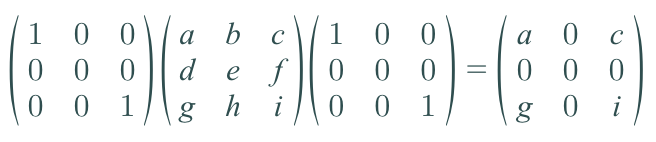
I just put dummy variables to fill up the covariance matrix. But as you can y has no variance and no covariance between any other variable, so it can be ignored, so you effectively just have the following covariance matrix.
[[a,c],
 [g,i]]
Combining Kernels
If you know that your function can be writing as the sum of two functions or a product of two functions, whose kernels are known, then you can combine their kernels to model the original function (there are other ways to decompose down a function but that is beyond the scope of this article). For example, imagine you know that your function is periodic and increasing, then you can add the periodic and liner kernels together. Why does this work? The intuition behind this is: you are producing a new kernel/covariance matrix that combines the characteristics of the individual kernels because each point is going to be correlated to their periodic component as well as its linear component. Take a look at the kernel below to understand this.
Posterior
Until now we haven’t used a GP. So let’s do that. To keep things simple, let’s try to model an increasing sin wave. So our kernel is going to be Klin+per = Klin + Kper. The posterior is just a conditional Gaussian distribution, and the conditional of a gaussian is another gaussian. So we just need to find the new parameters. This is how they are calculated (Wikipedia).
What the partitioning means, is x1 = all the unobserved x values, and x2 = the observed x values. x2 is the given information, and a is the corresponding y values for x2. I really liked this explanation by Marco to understand this equation. Here is an image of it.
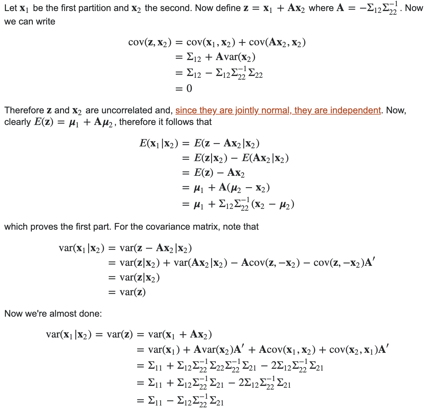
I’ve seen other explanations/proofs, but it clicked when I saw this one.
So let’s test it out!
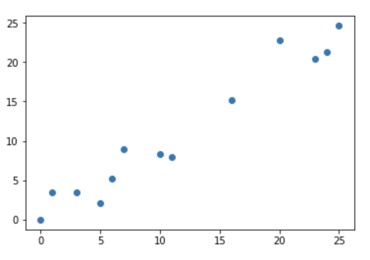
Here is the data I generated, and how I did it.
# Generate Data
x1 = []
x2 = []
y = []
n = 26 # range from 0 to 25

#X2 = observed points, y = correspoding value
#X1 = the rest of the points (unobserved)
for i in range(n):
    if(np.random.uniform()<.5): # make 50% of the points observed
        x2.append(i)
        y.append(math.sin(i)*3+i) #Sin Wave with 2x original amplitude + linear line with slope = 1
    else:
        x1.append(i)

y_ = y # for plotting later

y = np.asarray(y)
y = y.reshape(y.shape[0],1)
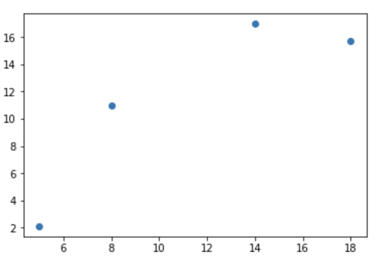
This is a plot of the observed data.
Now we need to find Σ11, Σ12, Σ21, and Σ22. Here is the code that does that, and K is equivalent to Σ.
def covii(x): # for Sigma_11 and Sigma_22
    K = np.zeros((len(x),len(x)))
    for i in range(len(x)):
        for j in range(len(x)):
            K[i][j] =  np.exp( -2*math.sin( math.pi*abs(x[i]-x[j])/(math.pi*2) )**2 ) + x[i]*x[j]
    return(K)

def cov12(x1,x2): # for Sigma_12
    K = np.zeros((len(x1),len(x2)))
    for i in range(len(x1)):
        for j in range(len(x2)):
            K[i][j] = np.exp( -2*math.sin( math.pi*abs(x1[i]-x2[j])/(math.pi*2) )**2 ) + x1[i]*x2[j]
    return(K)

def cov21(x1,x2): # for Sigma_21
    return(cov12(x1,x2).T)
Now we can calculate K11, K12, K21, and K22.
#Generate the covariance in block format
K11 = covii(x1)
K12 = cov12(x1,x2)
K21 = cov21(x1,x2)
K22 = covii(x2)
print(K11.shape)
print(K12.shape)
print(K21.shape)
print(K22.shape)
The shapes are
(22, 22)
(22, 4)
(4, 22)
(4, 4)
We know have everything to calculate the new mu and K. The following is the equivalent to the equation we saw to find the conditional distribution.
# Calculate the mu and Sigma of the posterior
mu = K12.dot(inv(K22)).dot(y)
K = K11 - K12.dot(inv(K22)).dot(K21)
If we take a quick peek at K, we can start to get an idea of what the graph would look like.
# Covariance of posterior
with sns.axes_style("white"):
    ax = sns.heatmap(K, square=True,  cmap=sns.cubehelix_palette(10,rot=-.2))
    plt.show()
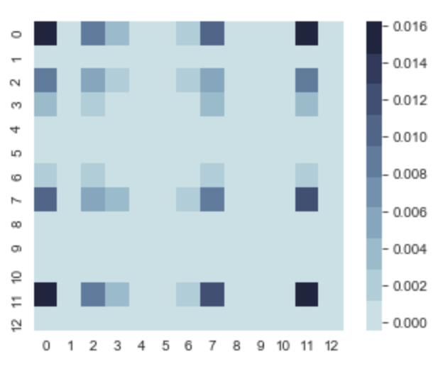
The darker areas on the variance diagonal, tell us that in those regions there can be more variance in the y values comparatively to other areas, but it’s still insignificant since the max value is 0.016. So there is going to be very little variance.
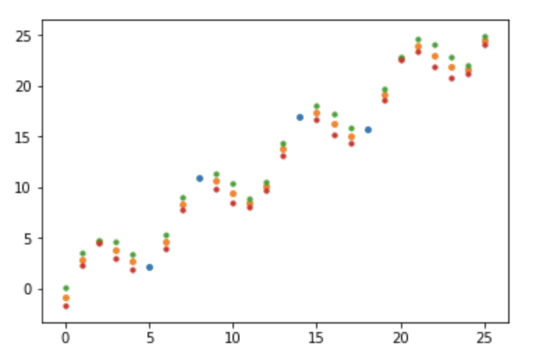
Now lets plot μ ± σ.
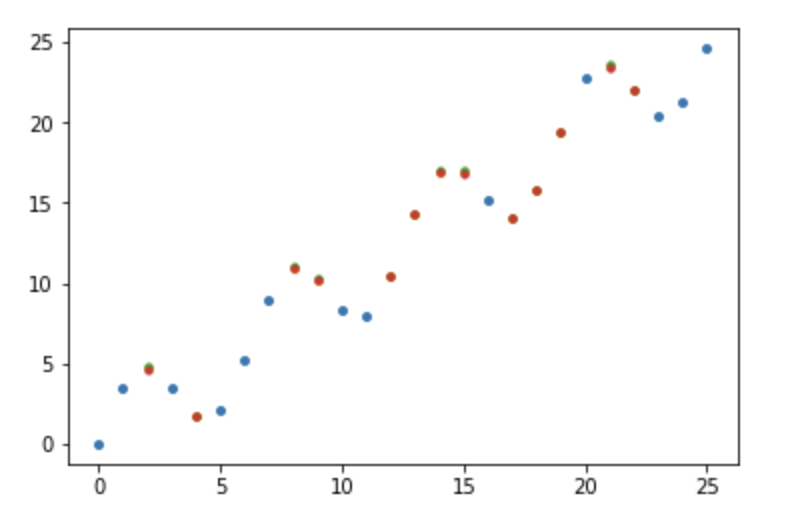
The scatterplot contains dots for both μ (orange) and 1 σ above (green) and below (red), along with the observed points (blue). However, we can’t see individual points since they are practically on top of each other. This is because there is low variance everywhere as we predicted.
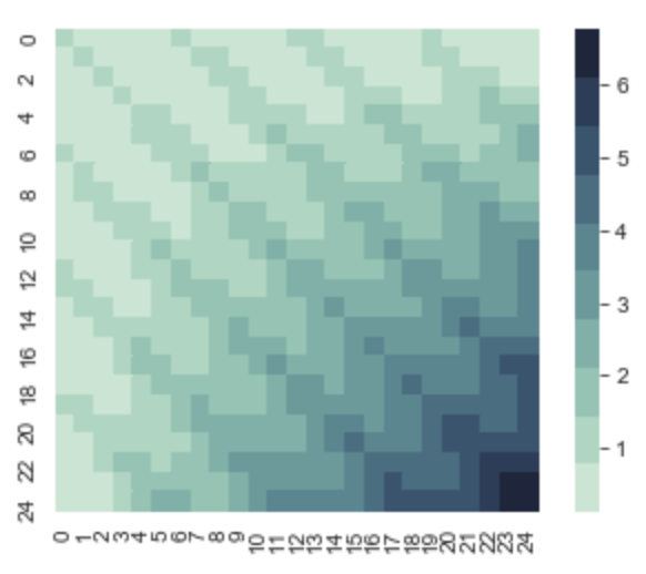
Now, let’s run the whole thing again, but this time feed it less observed points. Instead of only including 50% of the whole range in our observed points list, lets only use 20%.
We now get the following scatterplot.
And after we run the same calculations, we can take a look at K.
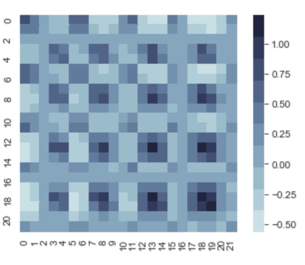
We can see that the max variance is 1, and in the dark regions on the variance diagonal, those x values have a much larger variance compared to our first regression model. Let’s see this in the newly generated scatterplot.
Now we can see the separate point markers, and in the regions where the posterior covariance matrix was dark on the variance diagonal, the μ ± σ markers are most separated which makes sense, since there are not many points close to that section in the period to constrain them.